For The Frozen Sting, I developed a sleek, sharp brand identity that embodies the bold and refreshing nature of a cocktail bar specializing in frozen margaritas. The goal was to create a visual experience that conveys the cool, crisp essence of the drinks while exuding a modern, edgy vibe that appeals to cocktail enthusiasts.
The creative process began with a deep dive into the world of mixology and nightlife culture. I wanted the brand to capture the intense, invigorating sensation of a perfectly crafted frozen cocktail, while also bringing in an element of sophistication. Inspiration was drawn from contemporary bar design, with a focus on minimalism and sharp lines to mirror the crisp, icy concept of the drinks.
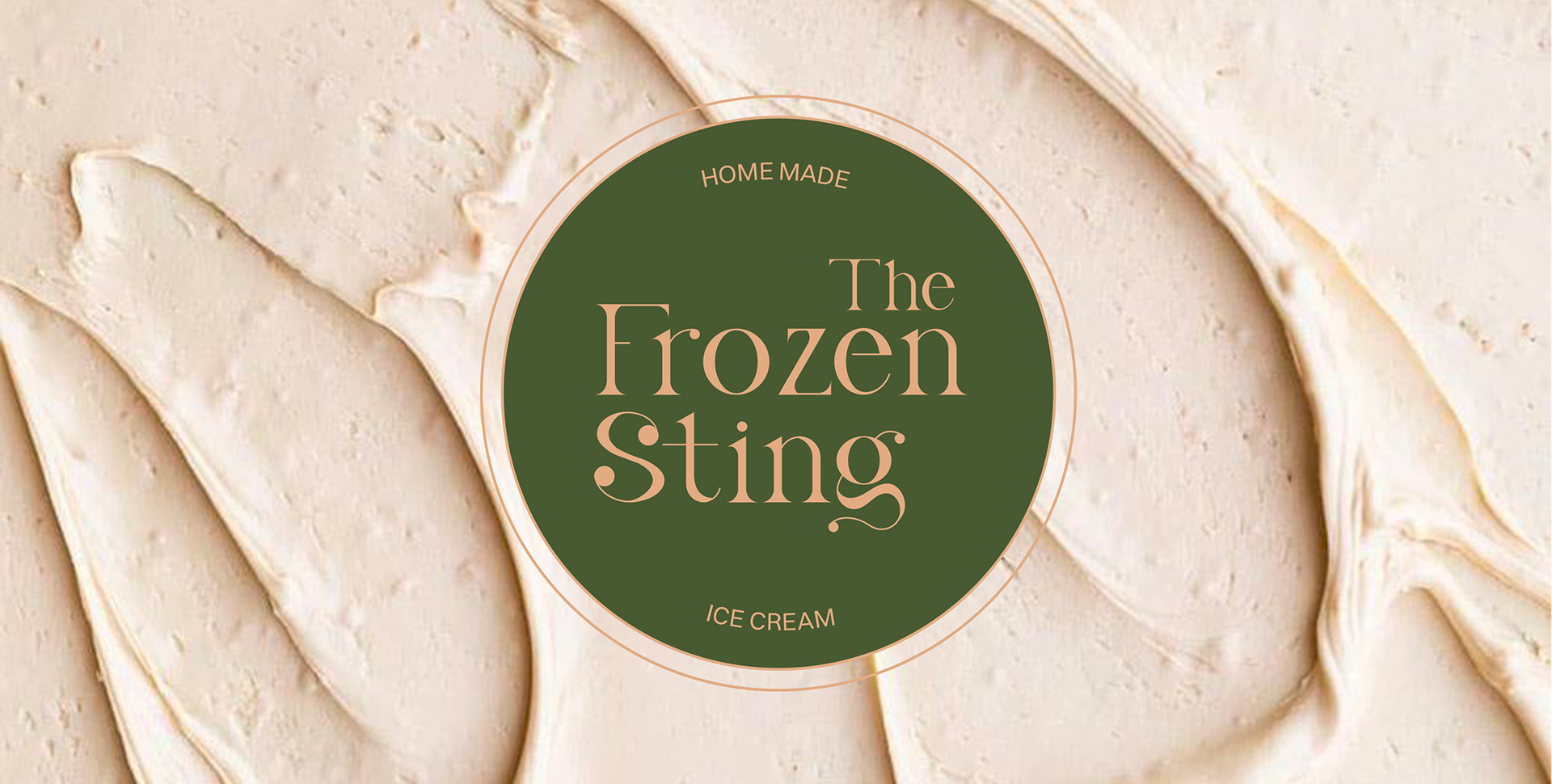
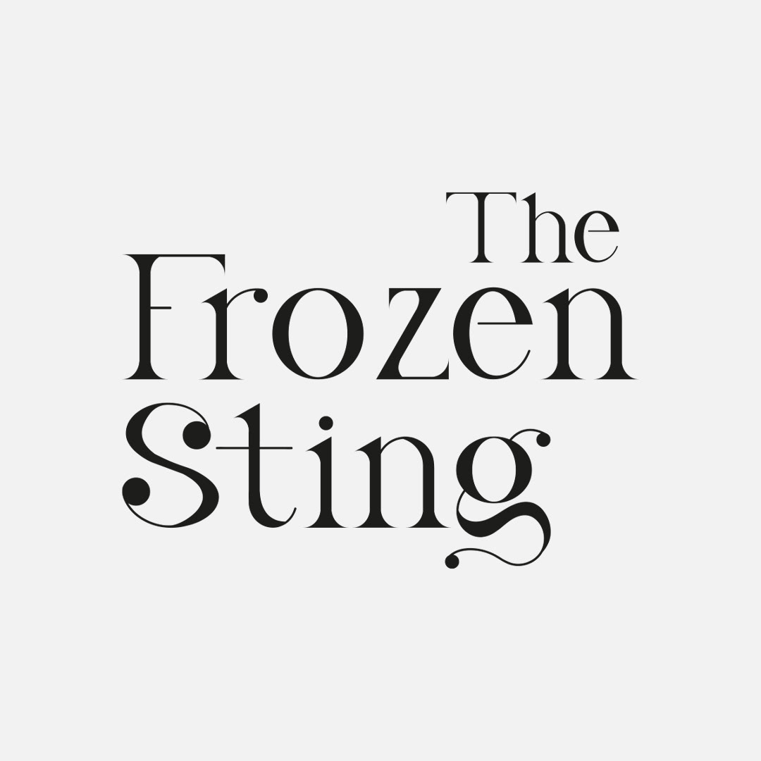
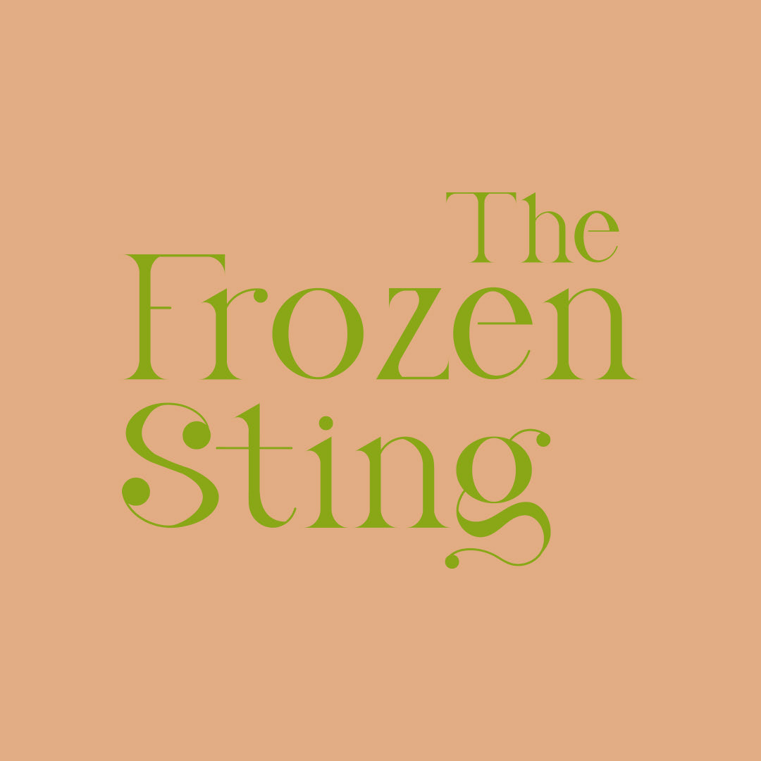
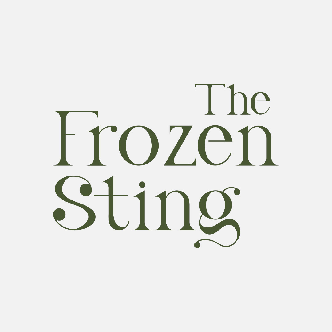
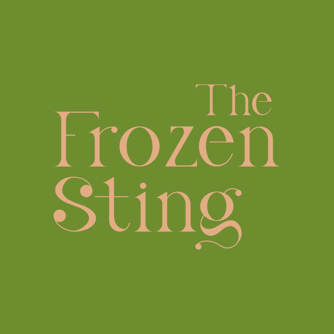
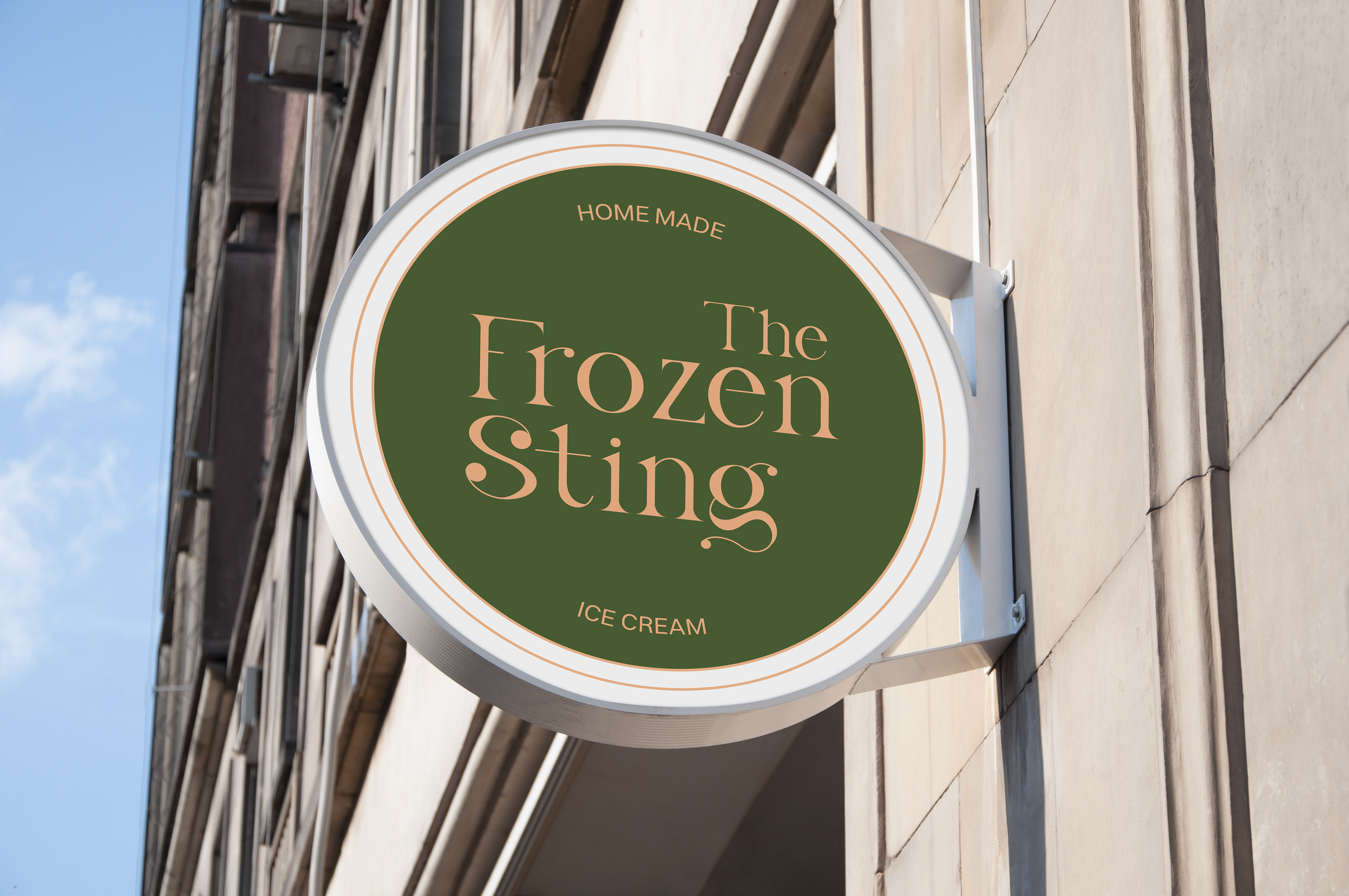
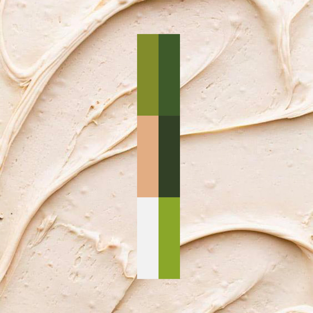
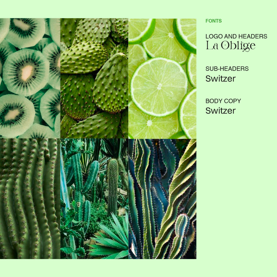
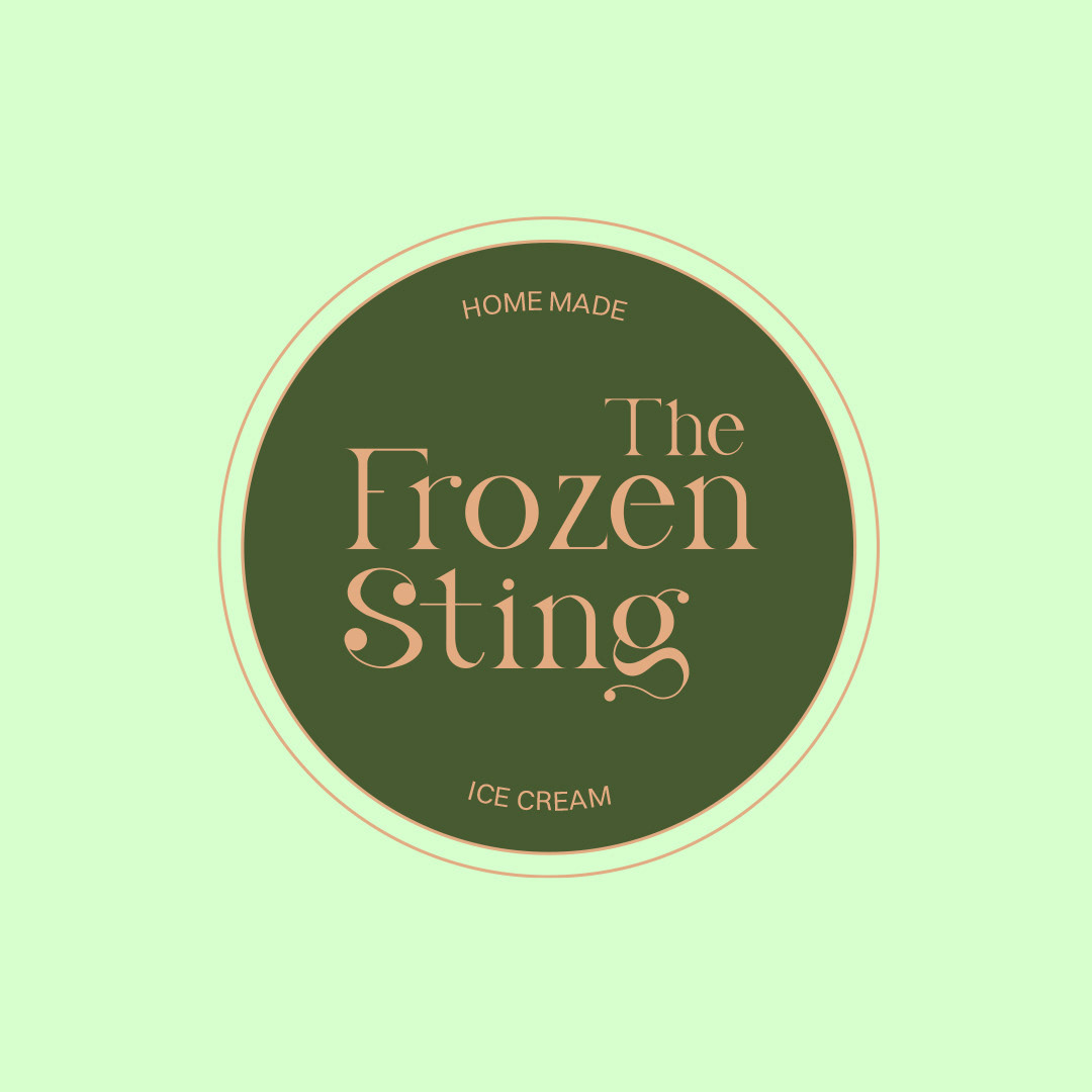
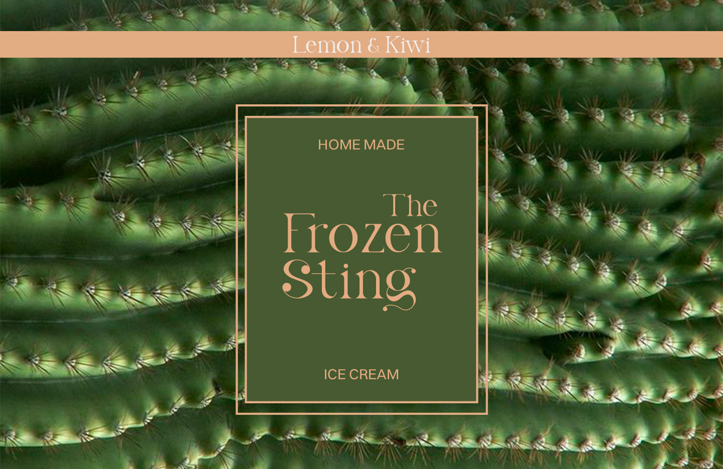
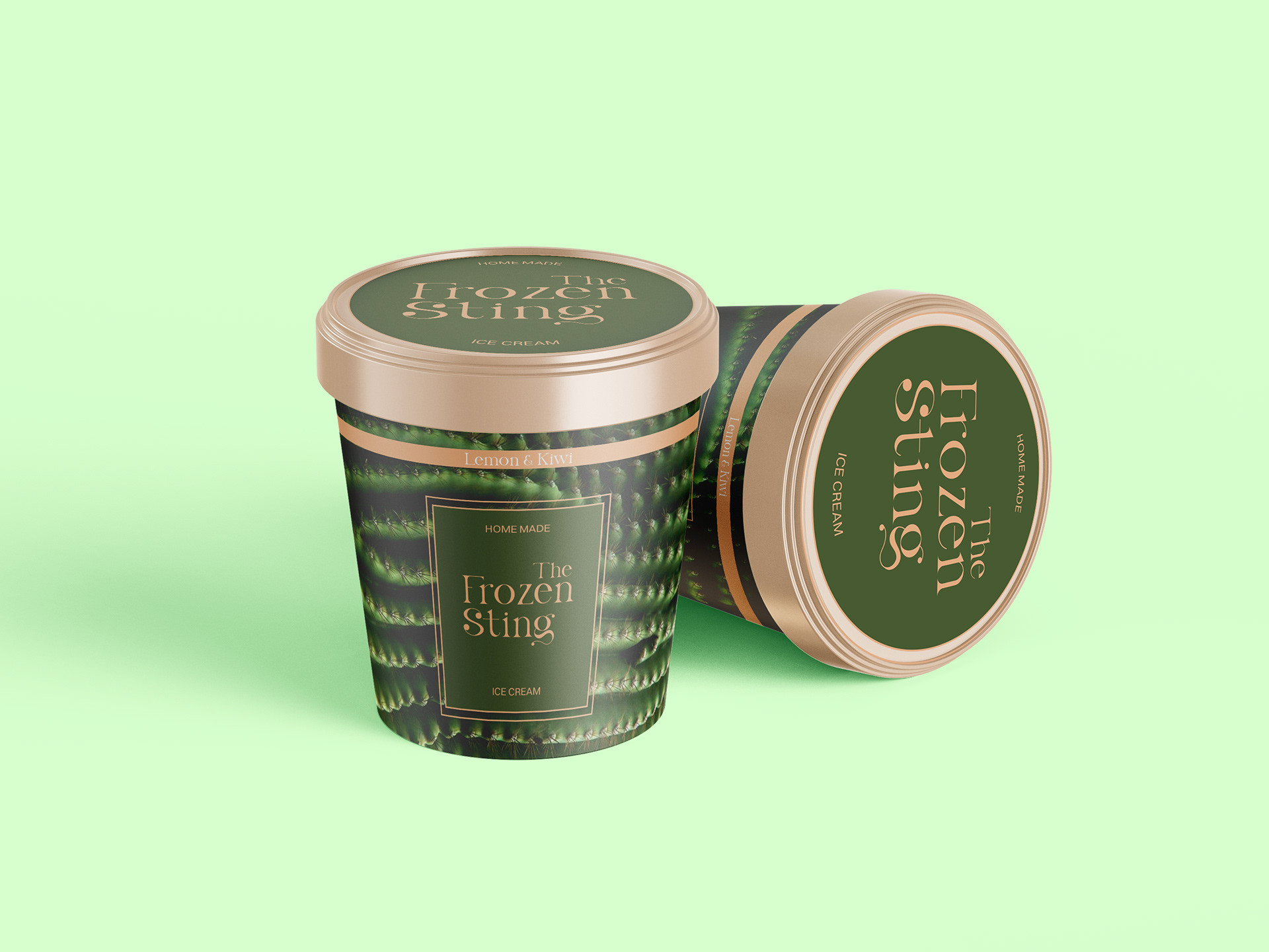
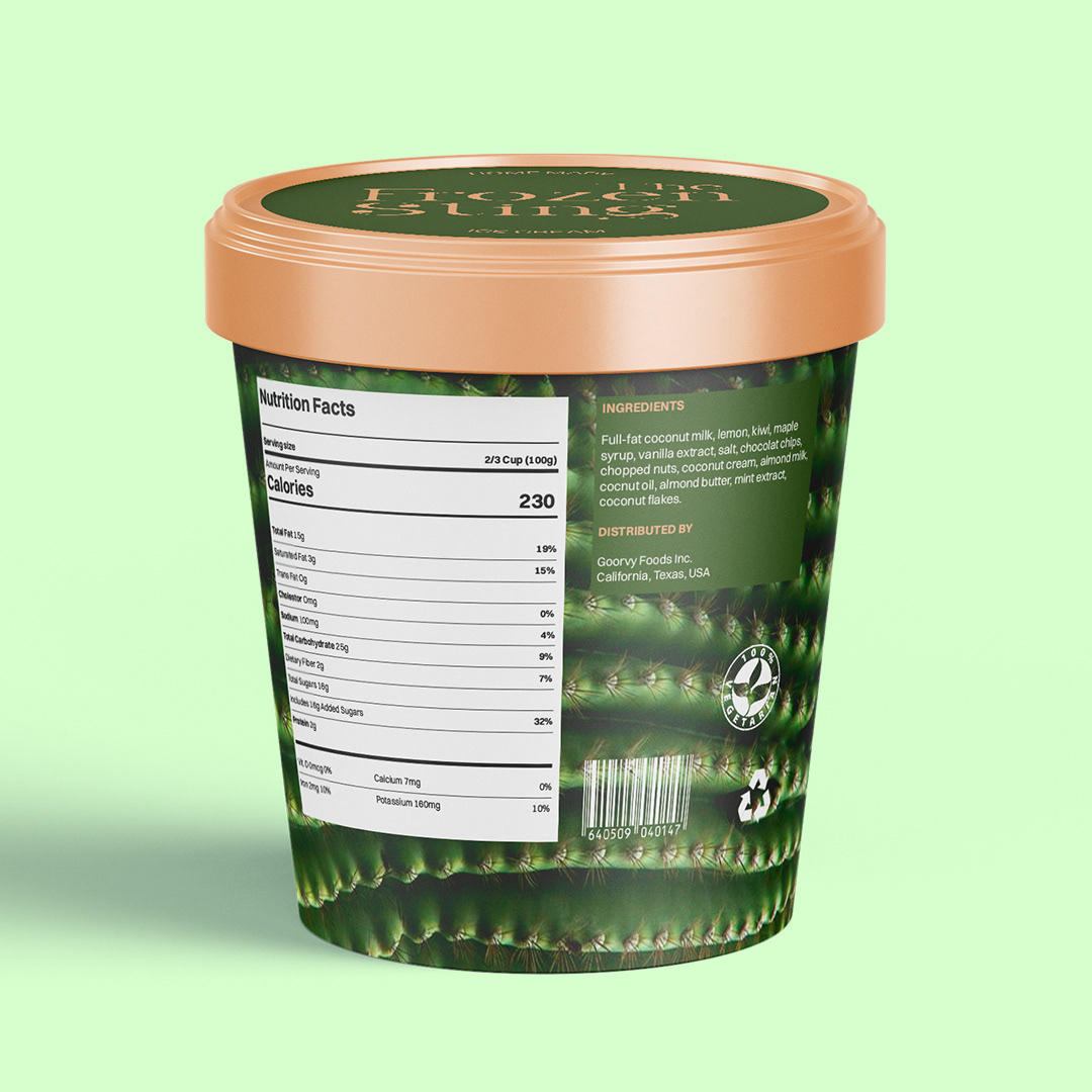
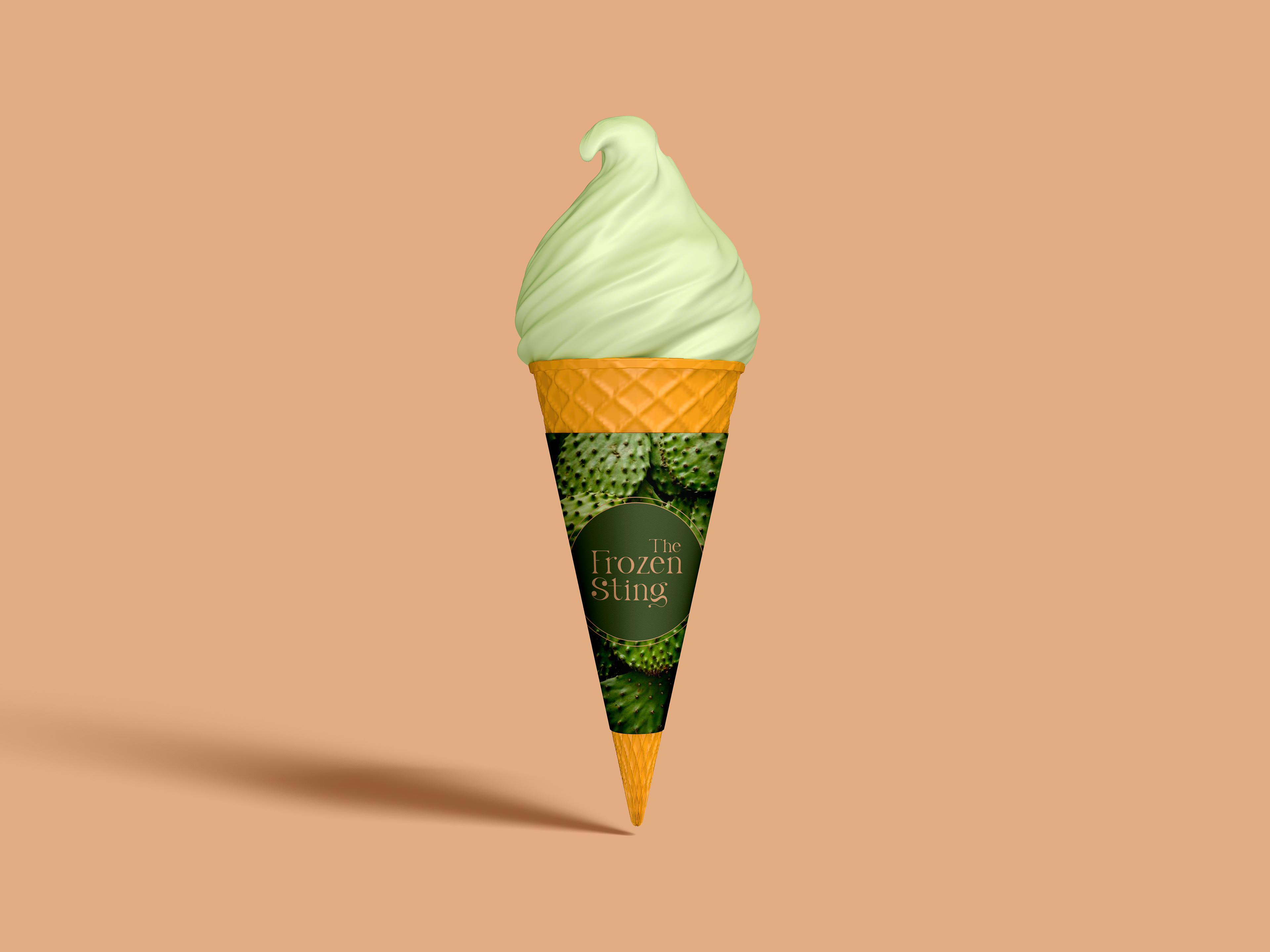
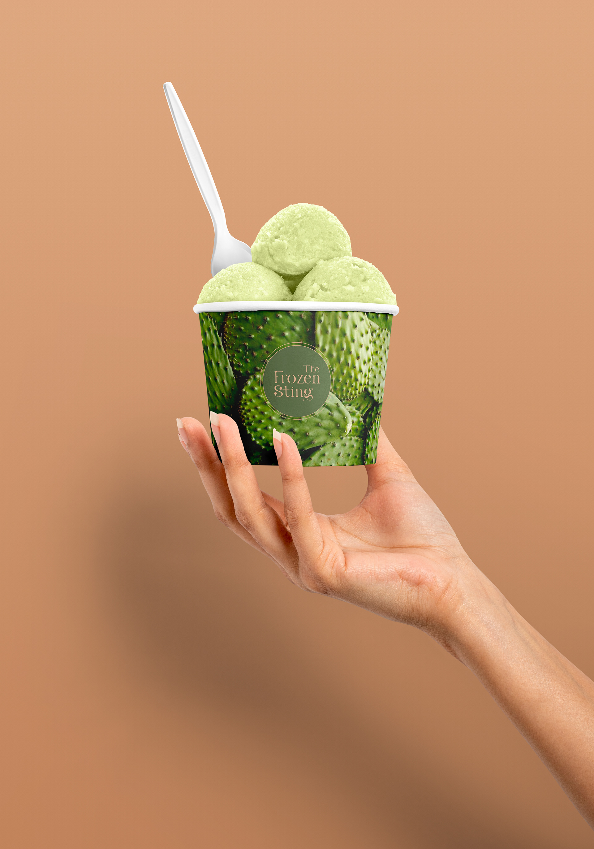
The logo design plays a key role in setting the tone for the brand. I chose bold, angular typography combined with a striking visual element—a stylized ice cube with a sharp sting—that reflects the refreshing yet potent nature of the cocktails. The color palette, consisting of deep blues and cool metallic tones, was selected to evoke the feeling of cold, while adding a sleek, luxurious touch to the overall aesthetic.
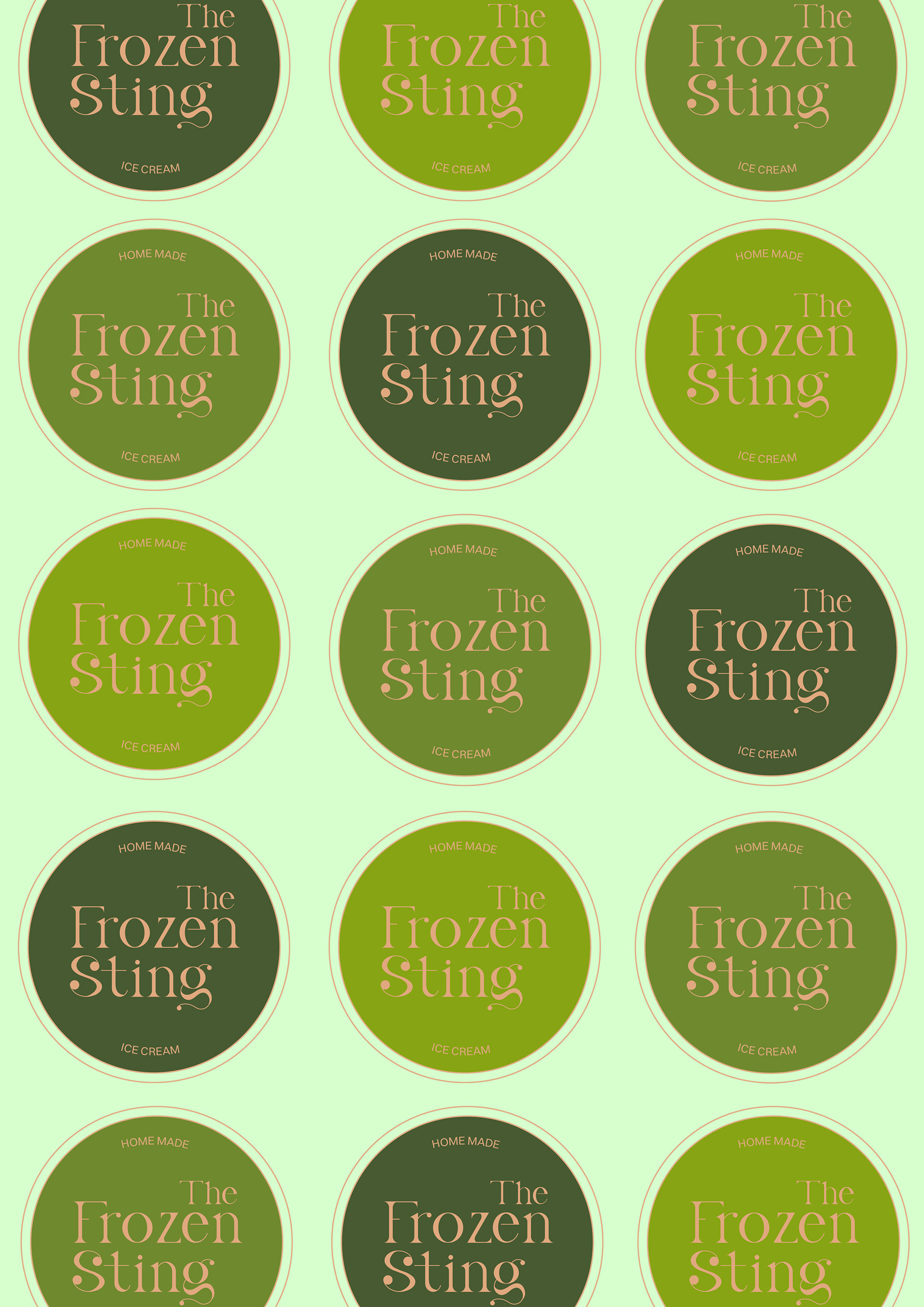
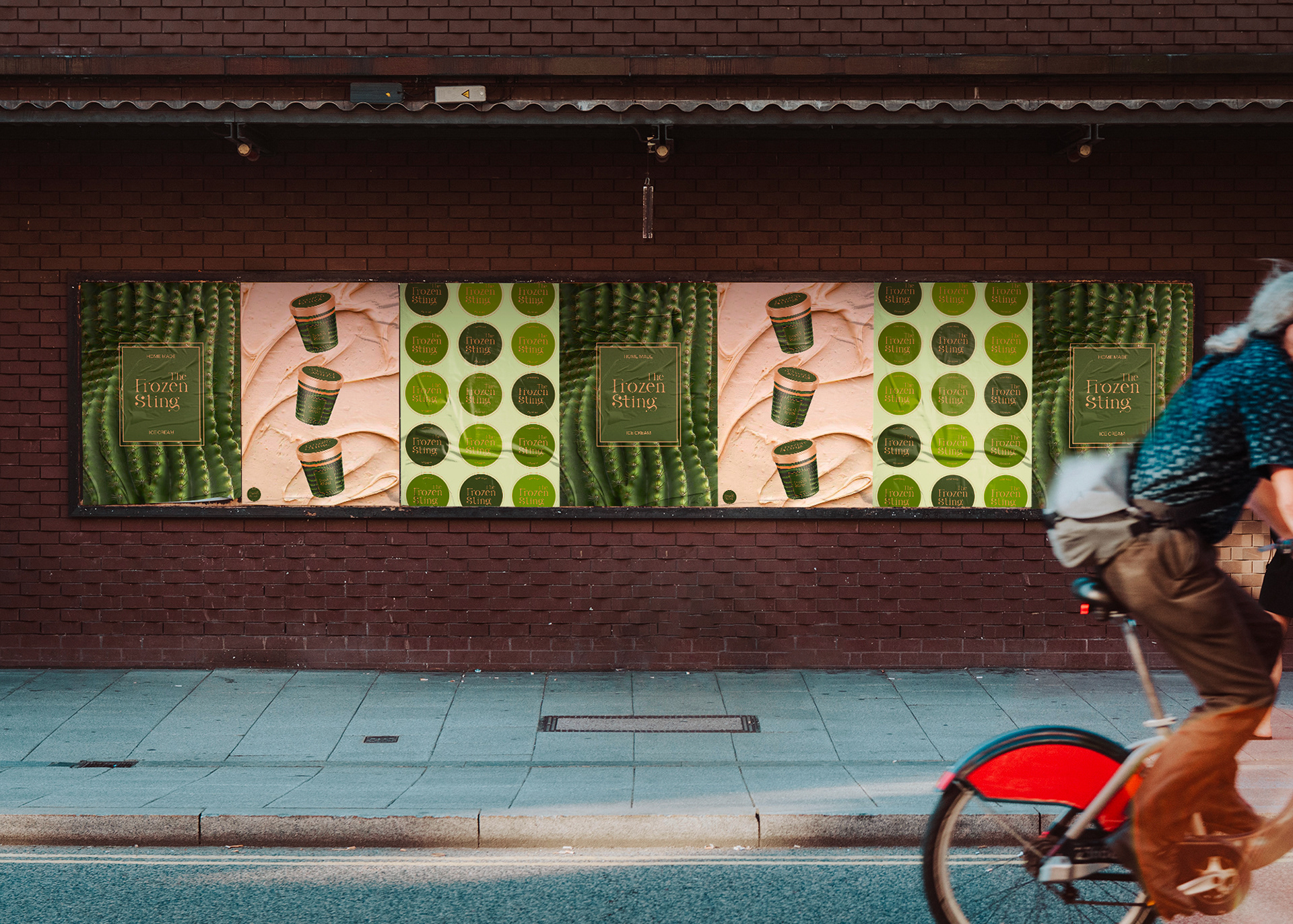
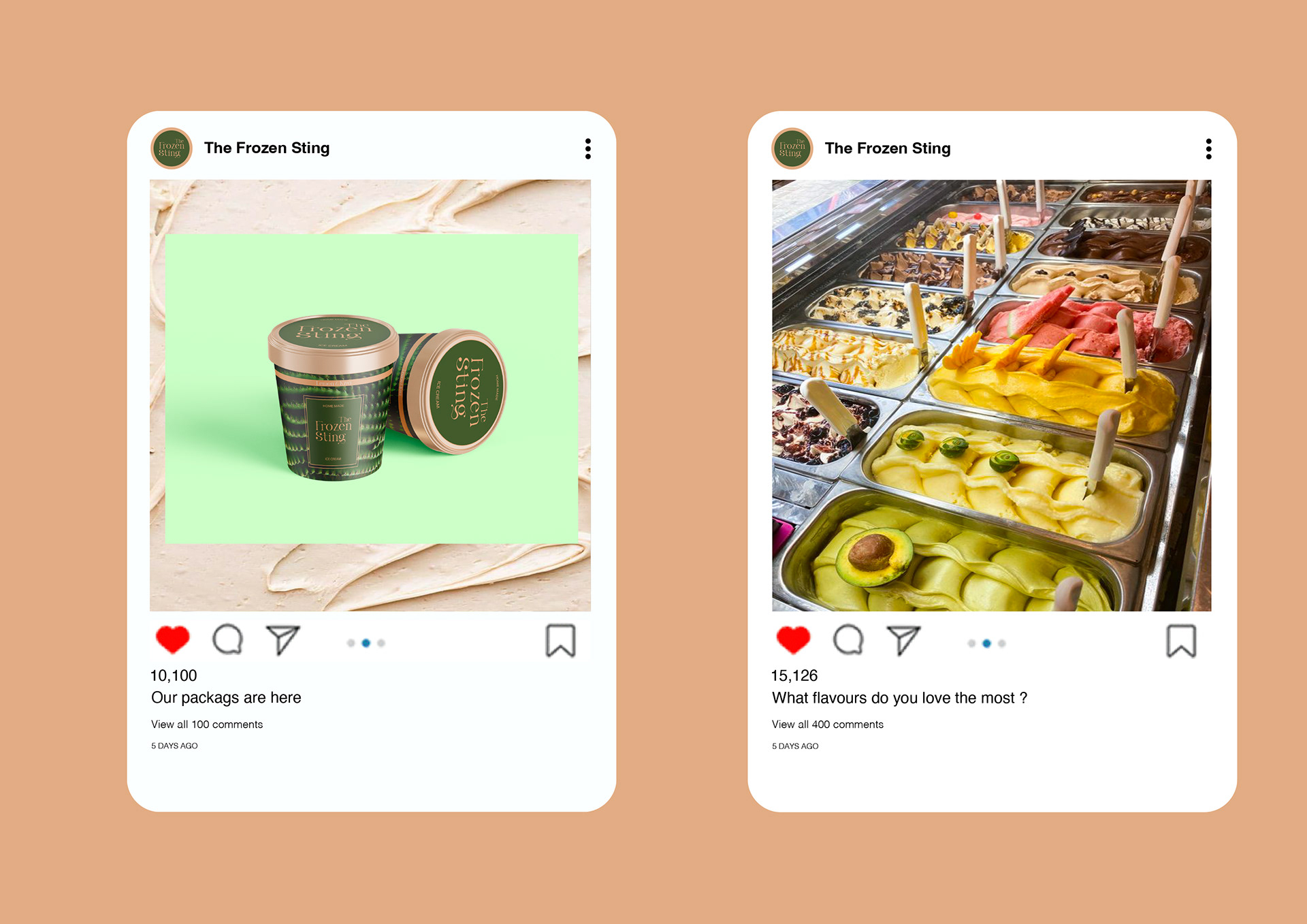
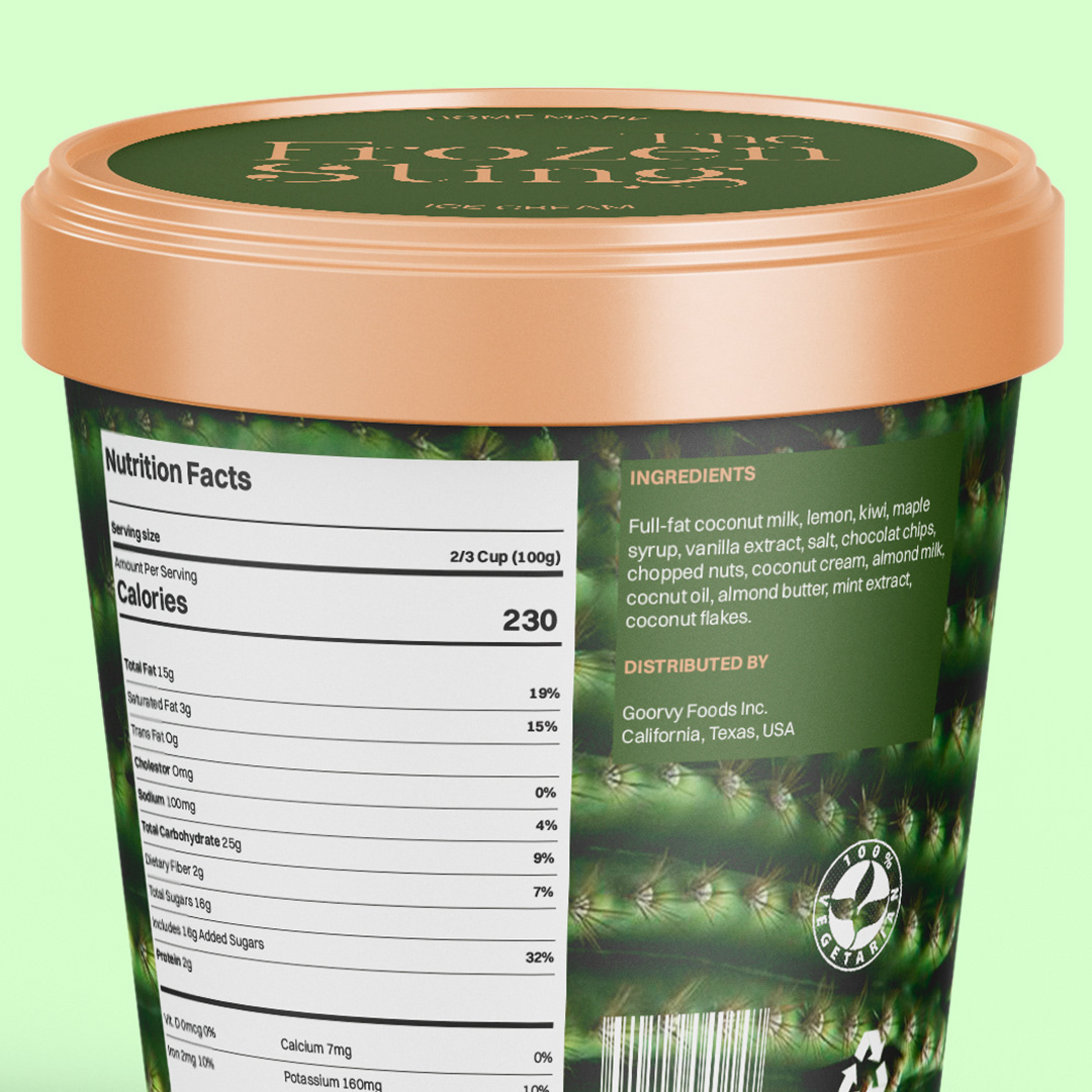
This identity extends across various brand elements, from the menu design to signage and packaging. Each piece reflects the modern, refined nature of the bar, with clean layouts and minimalistic design choices that emphasize the sophistication of the drinks. Whether it’s a cocktail glass, a napkin, or the bar’s digital presence, the brand maintains a cohesive, icy cool appearance that leaves a lasting impression.
Throughout the process, I worked to balance the boldness of the concept with a level of elegance, ensuring that The Frozen Sting feels both refreshing and refined—perfectly capturing the essence of its unique frozen cocktails.