As the creative behind Sababeer, I set out to craft a vibrant and fun brand identity that embodies the laid-back, community-driven spirit of this local Israeli craft beer. My challenge was to design a brand that feels authentic to its roots, reflecting the casual and social nature of beer culture in Israel while giving it a modern, playful edge.
The concept was born from the essence of the word "Saba," meaning "cool" or "chill" in Hebrew slang. I wanted to convey the feeling of sharing good times over a beer, drawing inspiration from Israel’s landscapes and beach culture. The goal was to create a brand that invites camaraderie, relaxation, and a sense of connection, making every sip feel like part of an experience.
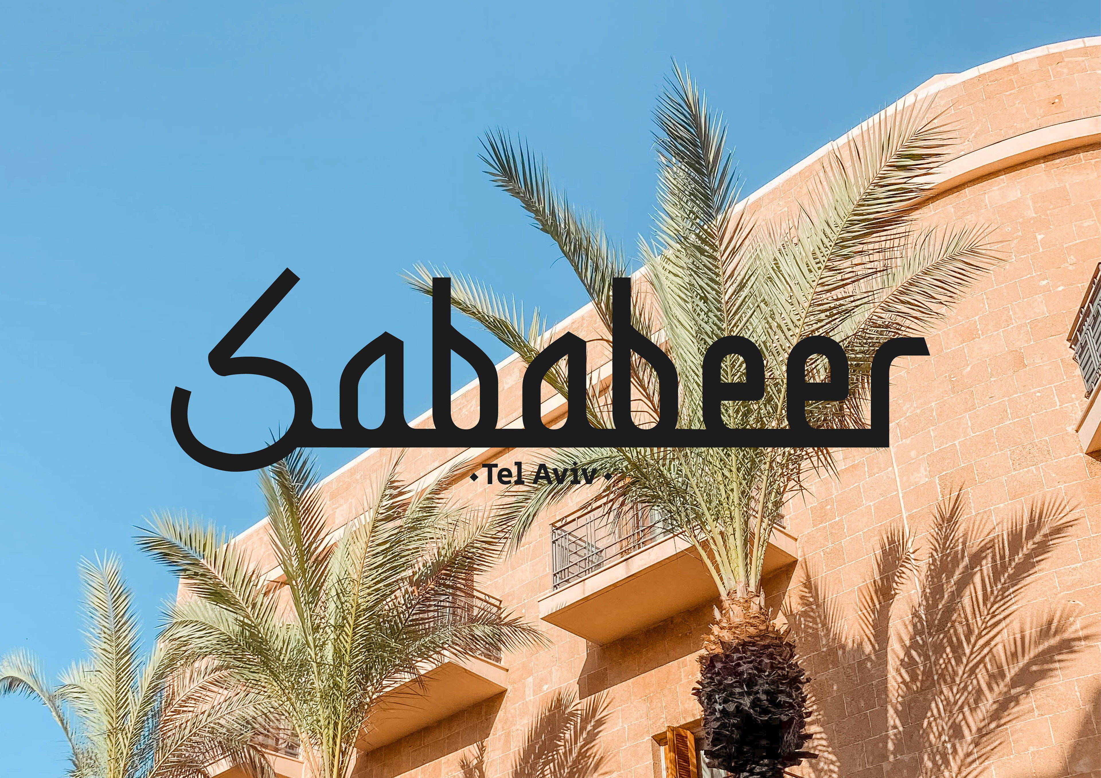
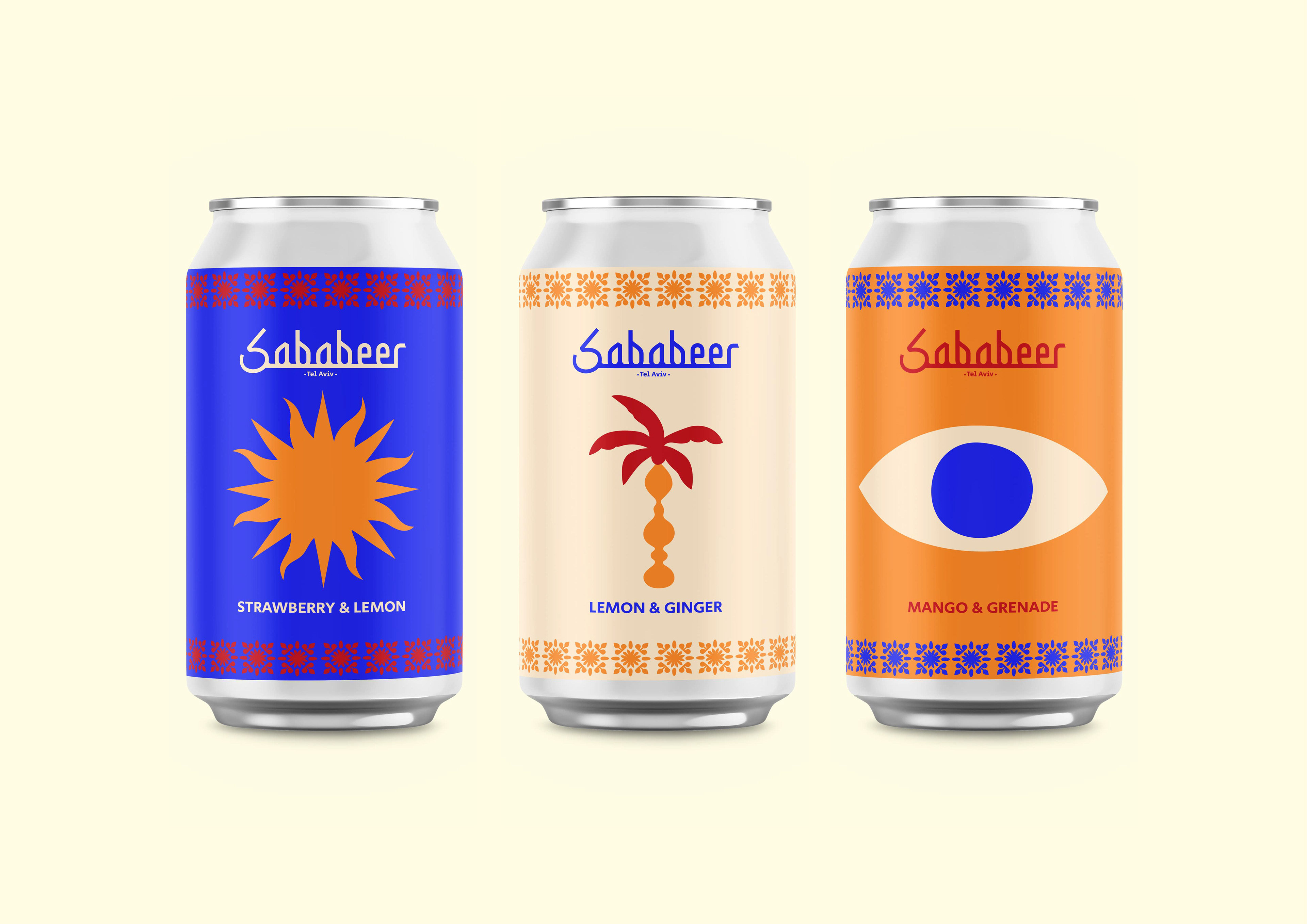
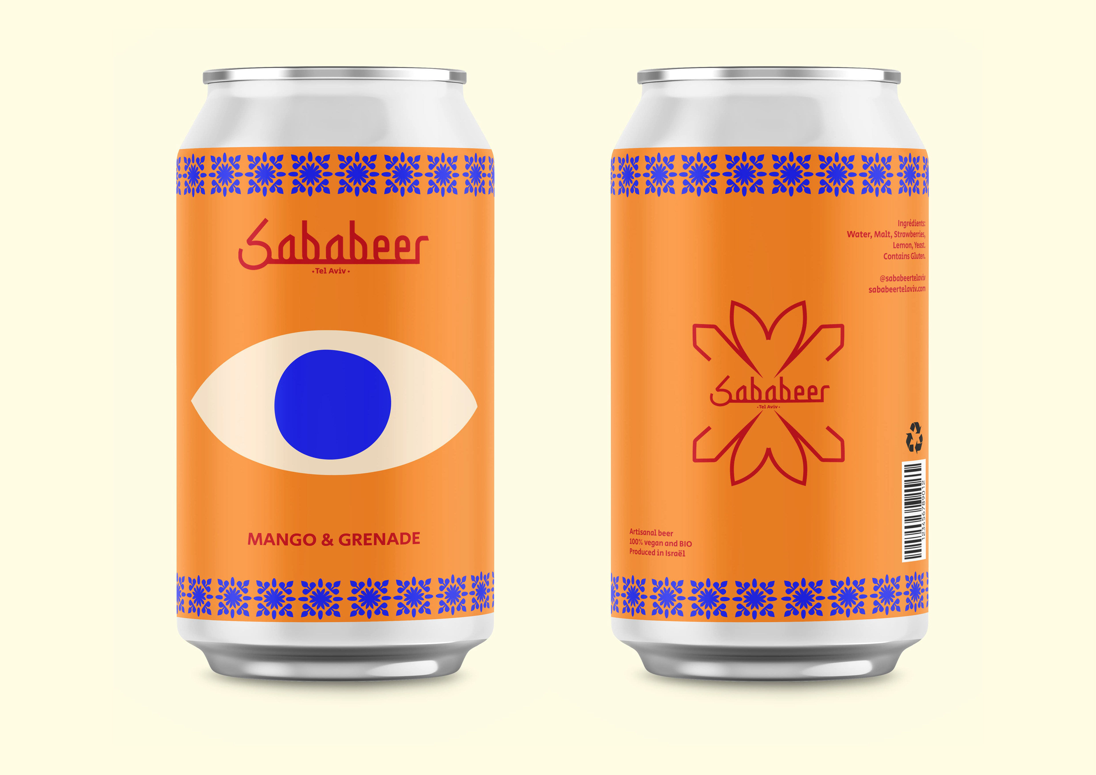
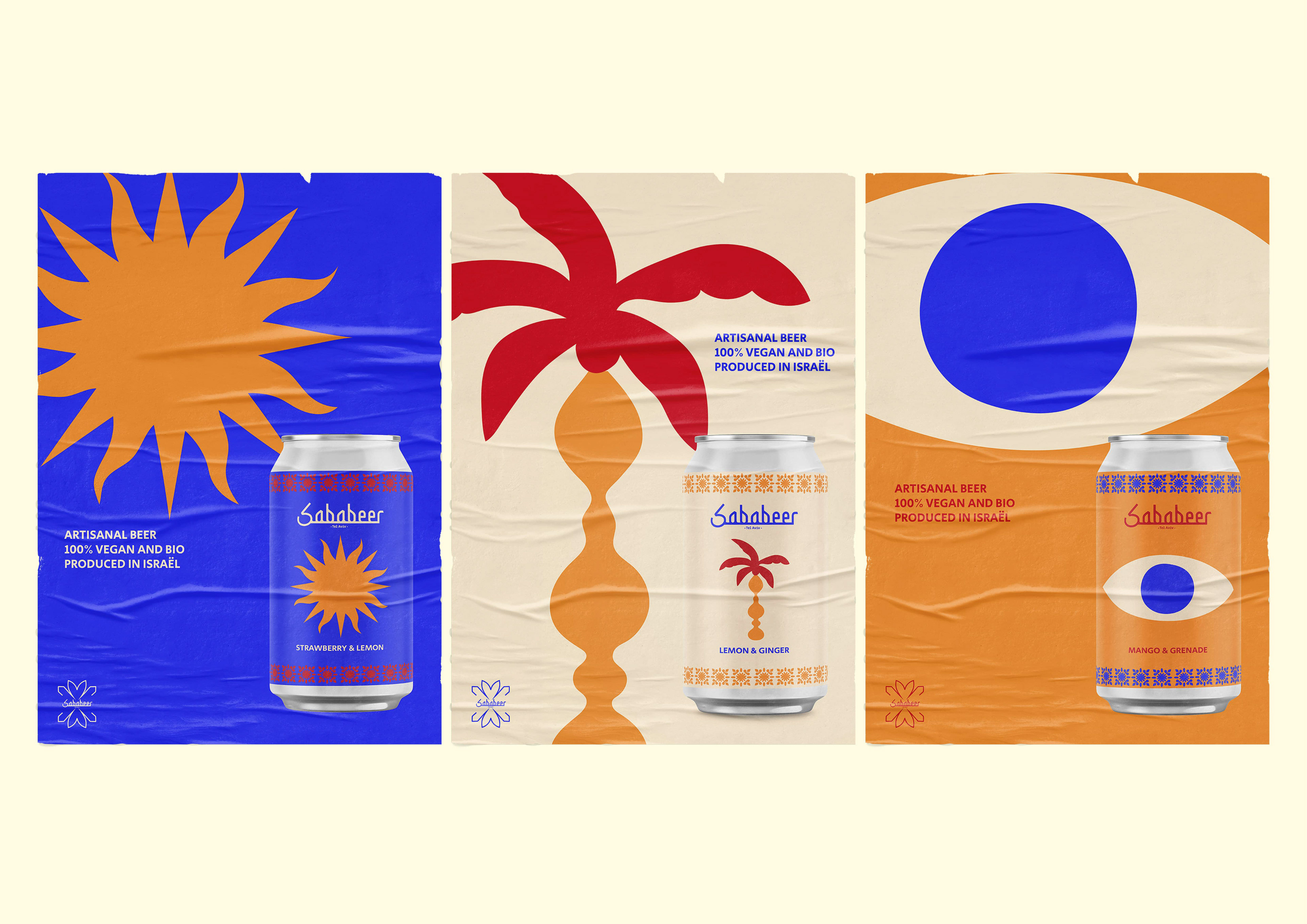
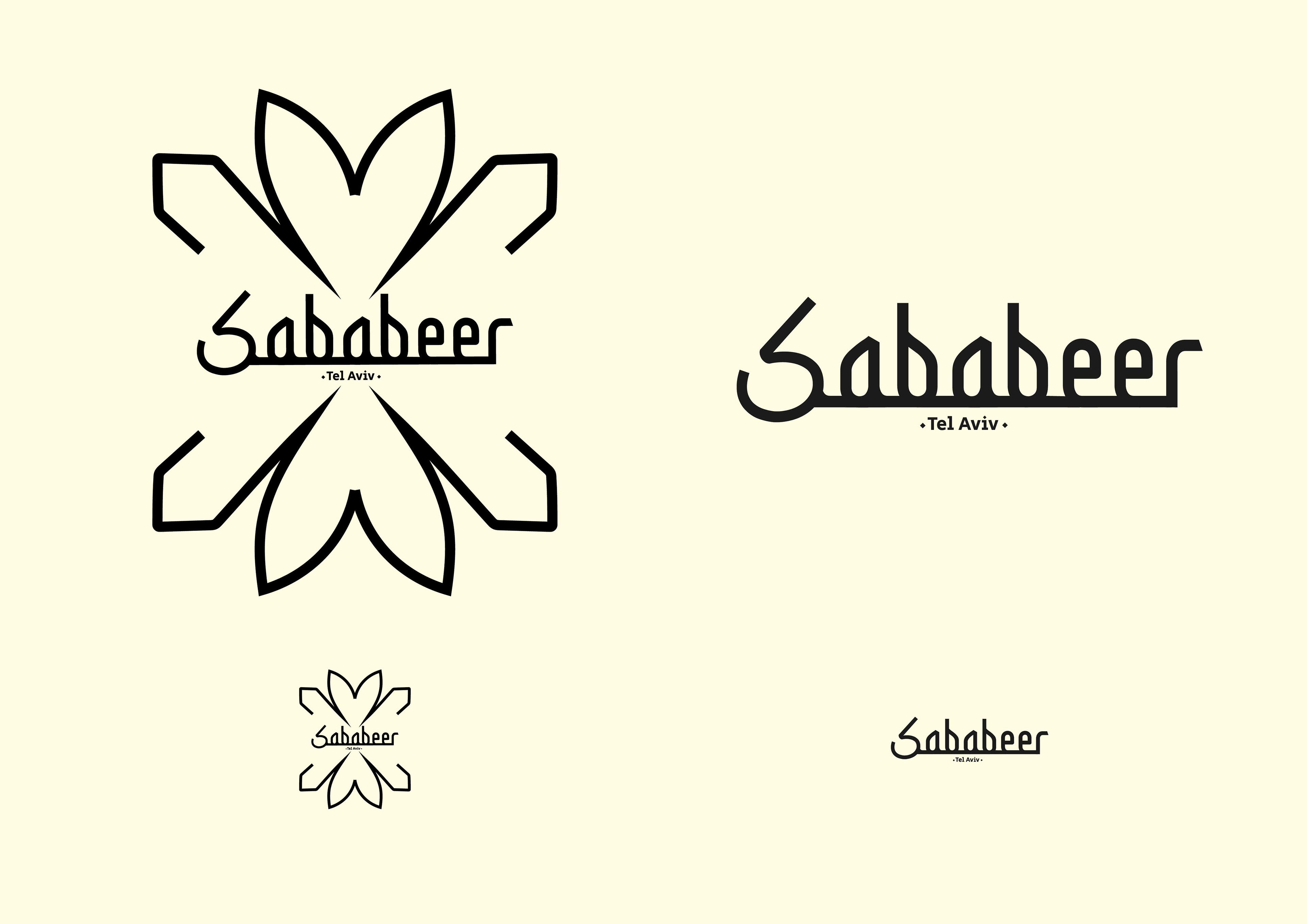
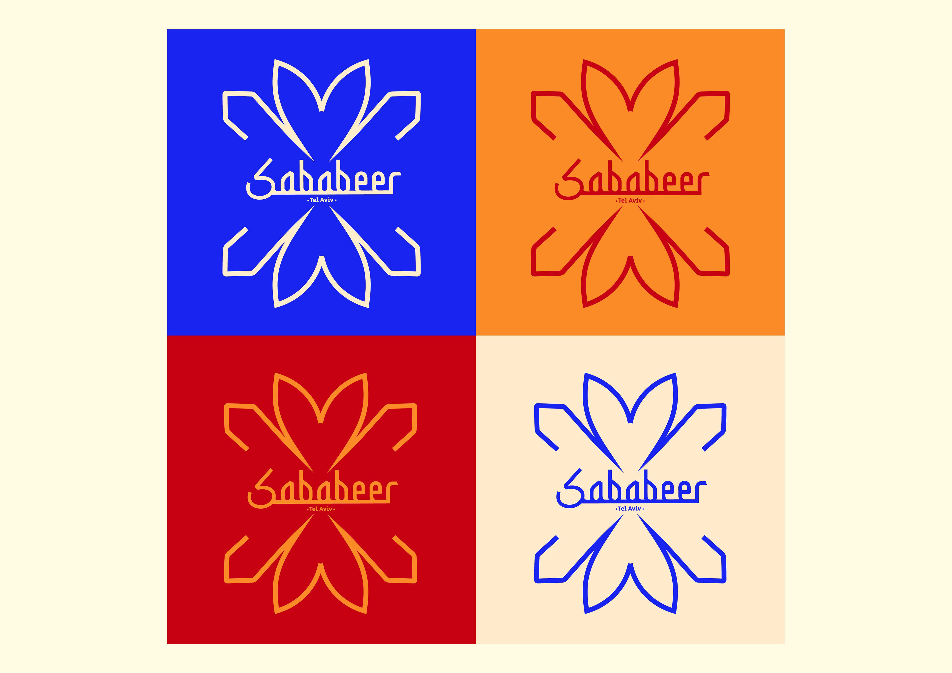
The logo design became the anchor of the brand’s personality—bold, energetic, and hand-drawn to emphasize its fun, approachable vibe. The typography has a relaxed, slightly quirky feel that stands out and makes the brand memorable. I chose a bright, cheerful color palette with vibrant blues, yellows, and greens to evoke the warmth of sunny days, cold beers, and good company.
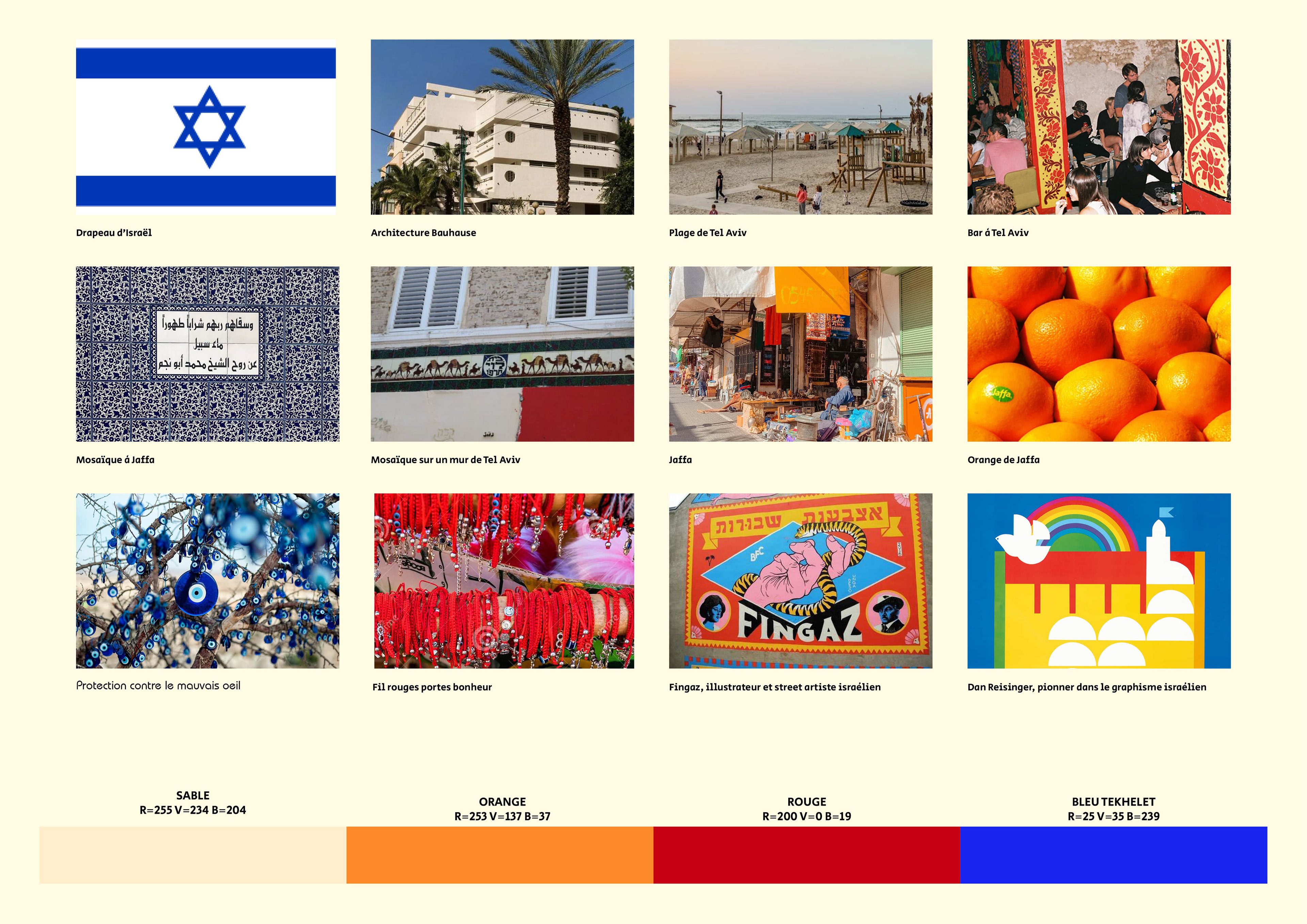
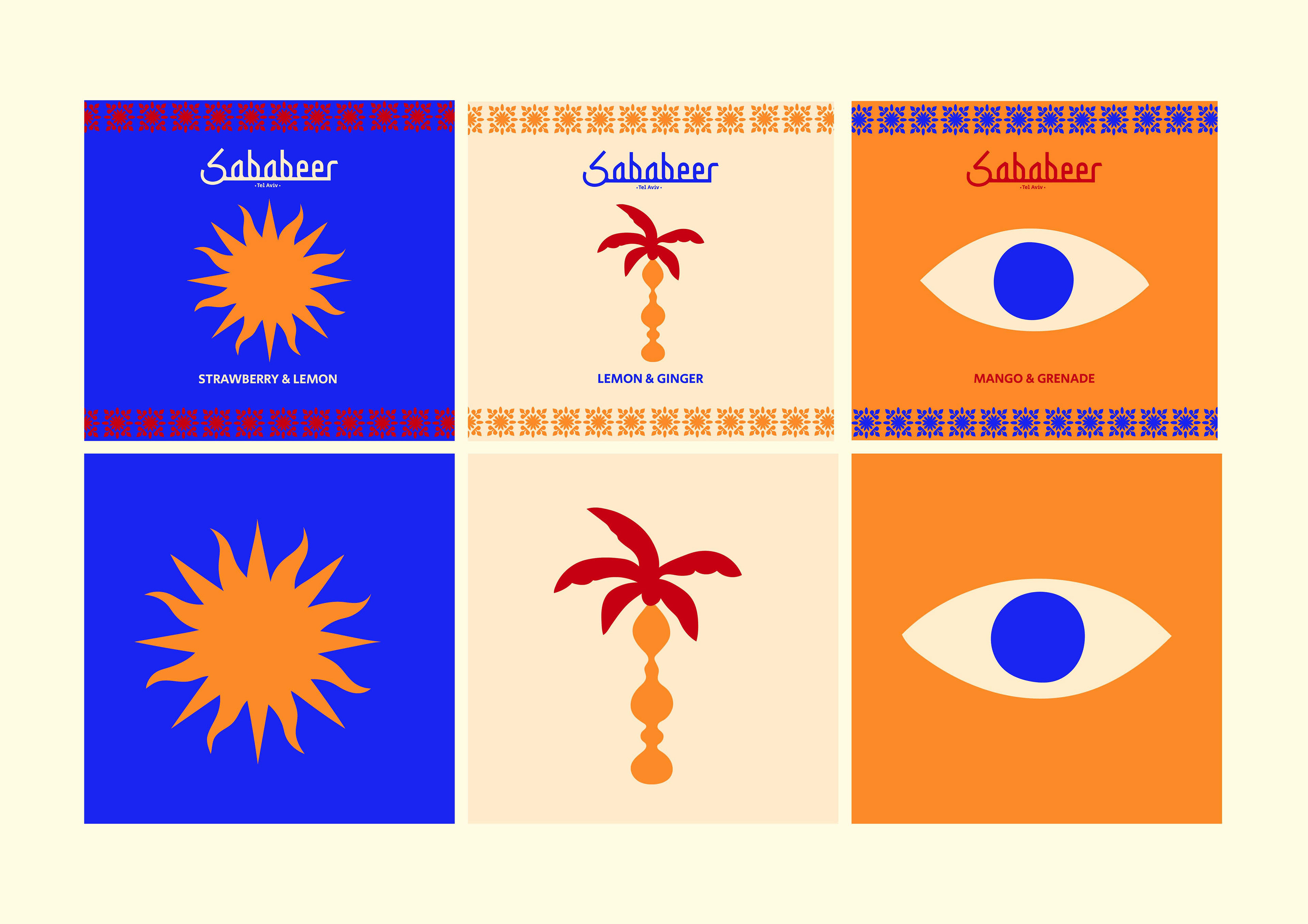
I extended this identity into the packaging, where each beer label features unique, colorful illustrations inspired by the local environment, from the beach to the desert to the lively city of Tel Aviv. The designs are full of personality, making every beer a part of the broader Sababeer story.
Through this branding, I wanted to capture the essence of Sababeer as more than just a craft beer—it's about enjoying life’s simple pleasures with friends and good vibes. The visual identity brings this spirit to life, making Sababeer a celebration of community, relaxation, and fun.