For Holy Tacos, the goal was to create a bold and energetic brand identity that captures the vibrant, lively spirit of Mexican street food while appealing to a contemporary audience. The challenge was to design a visual language that conveys the authenticity of the cuisine with a playful, modern twist, making the brand feel exciting and inviting for customers.
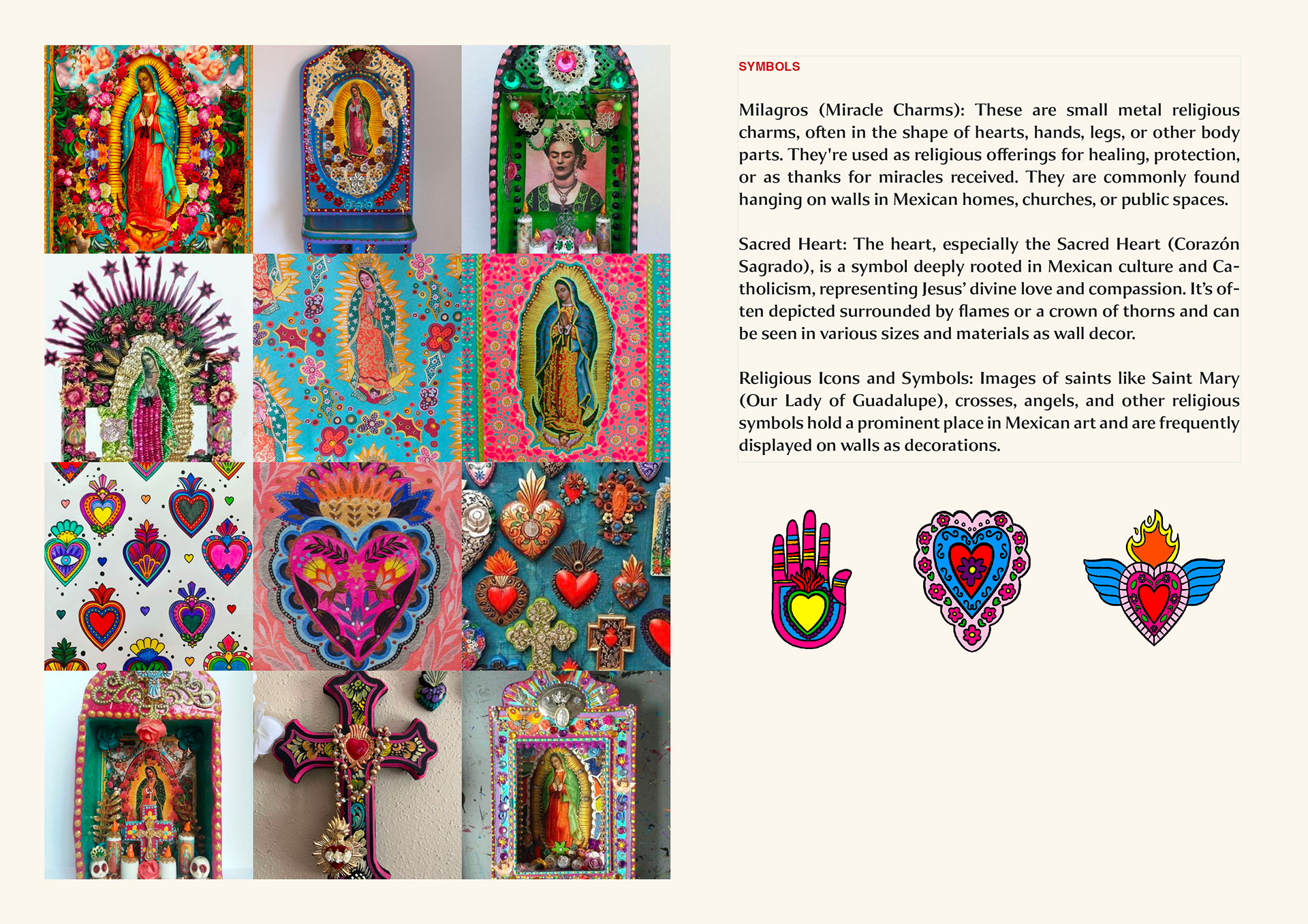
The design process started by immersing myself in the colorful world of Mexican culture and street food markets, drawing inspiration from traditional motifs, bright colors, and bold typography. This research informed the direction of the brand’s identity, which needed to stand out with personality while remaining authentic to its roots.
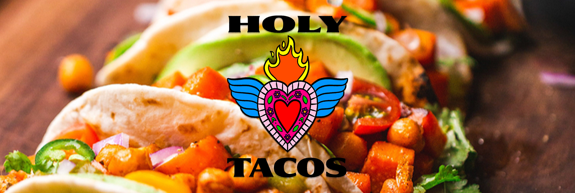
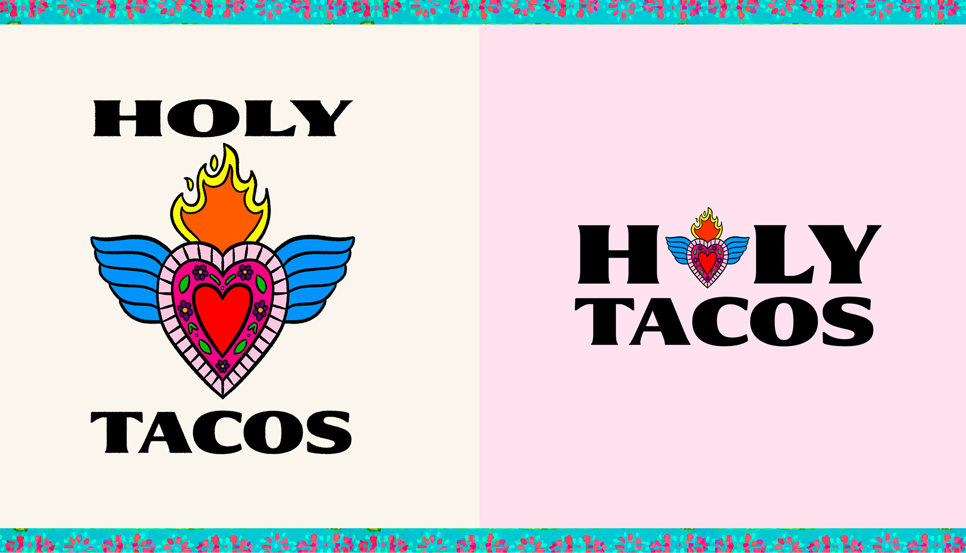
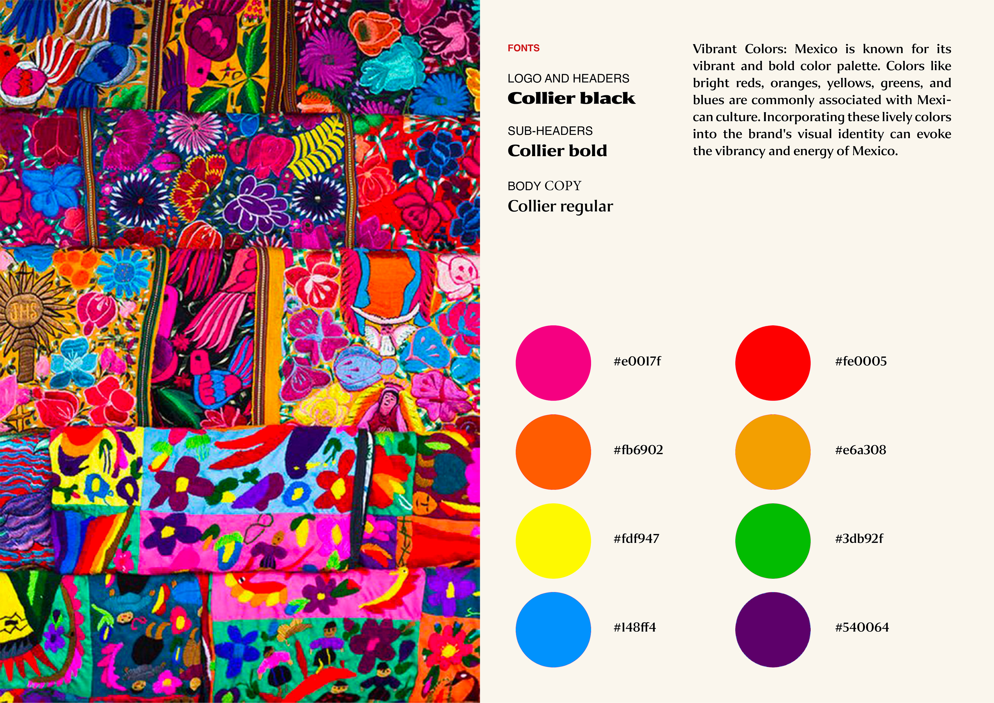
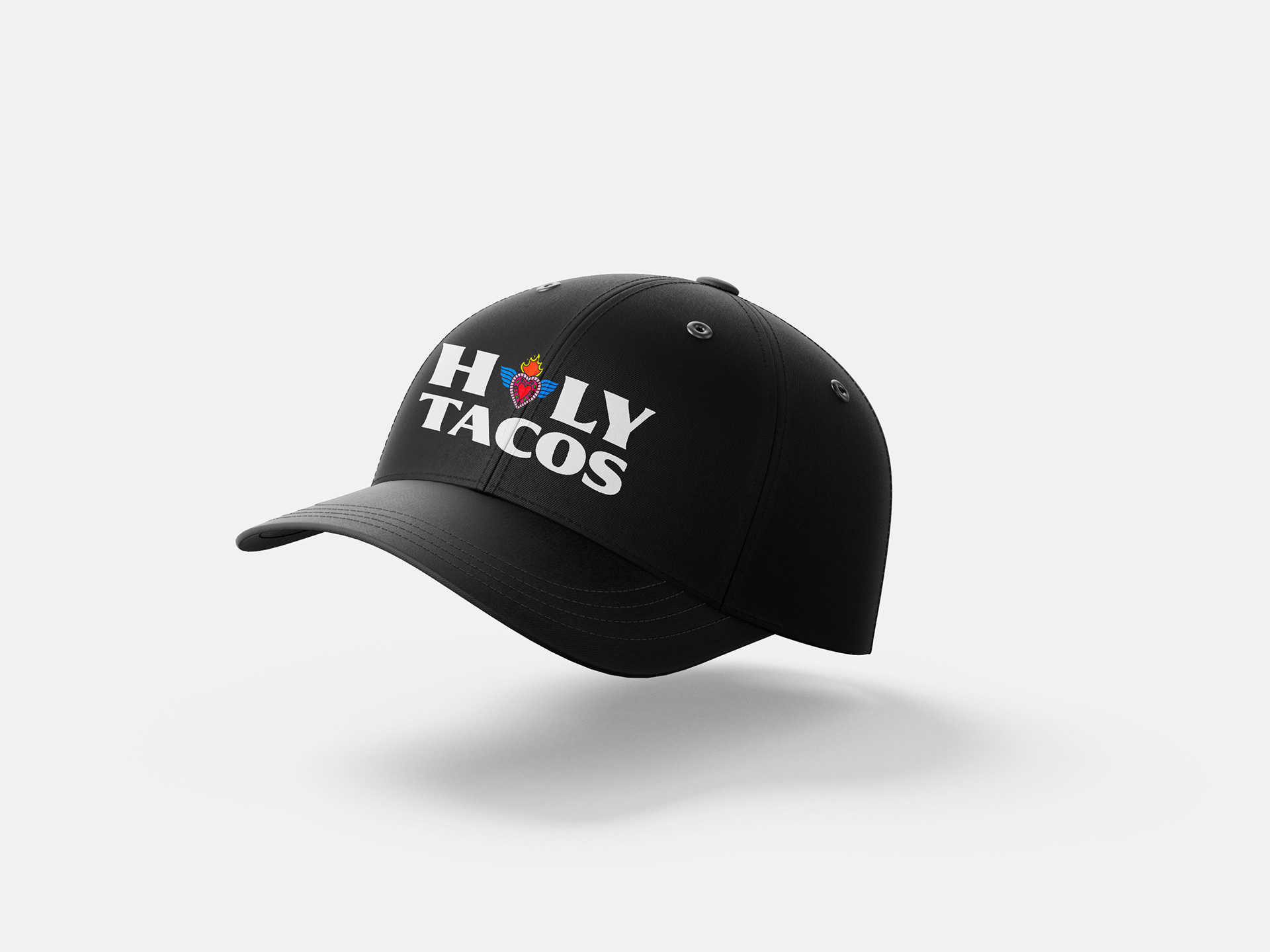
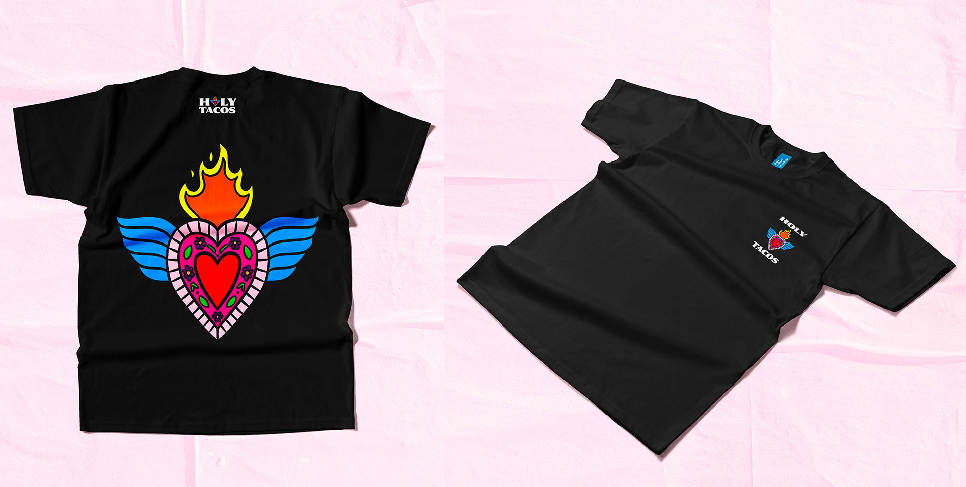
The logo design became the centerpiece of the brand, featuring strong, dynamic typography and vivid illustrations that evoke the energy and fun of enjoying tacos with friends. I chose a vibrant color palette of fiery reds, yellows, and greens, reminiscent of the rich flavors and ingredients found in Mexican cuisine. These colors create a sense of excitement and warmth, instantly drawing attention to the brand.
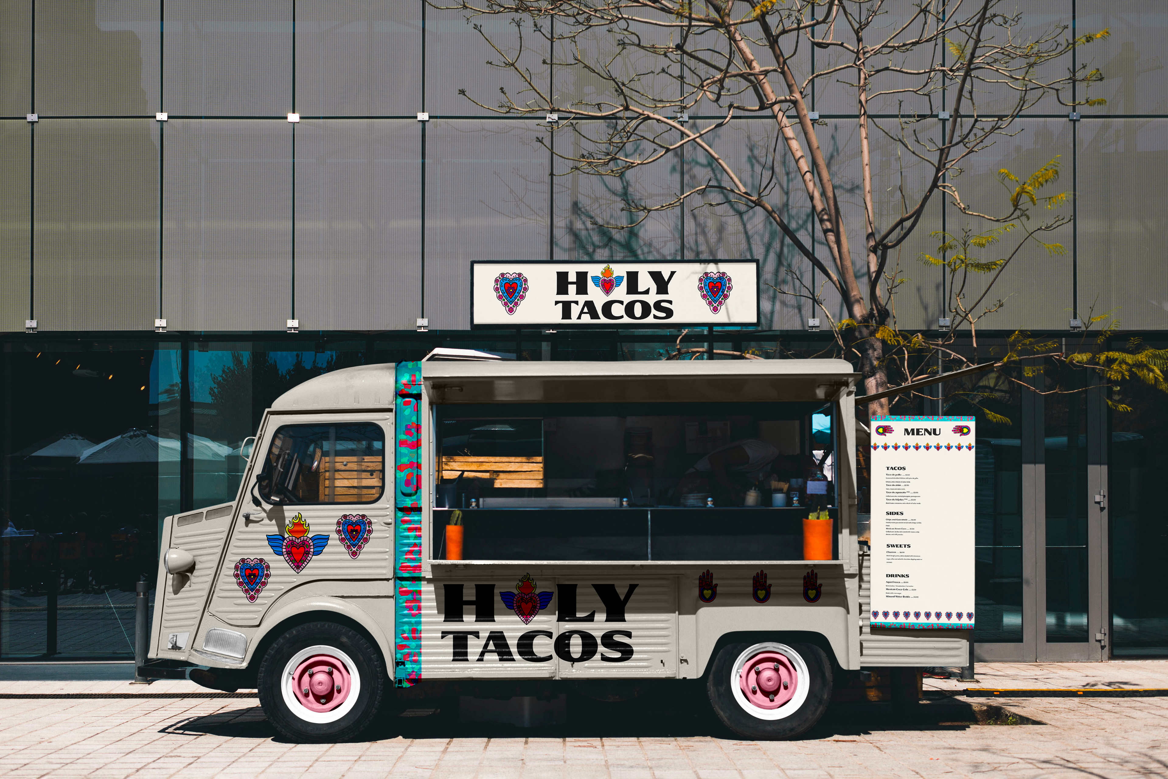
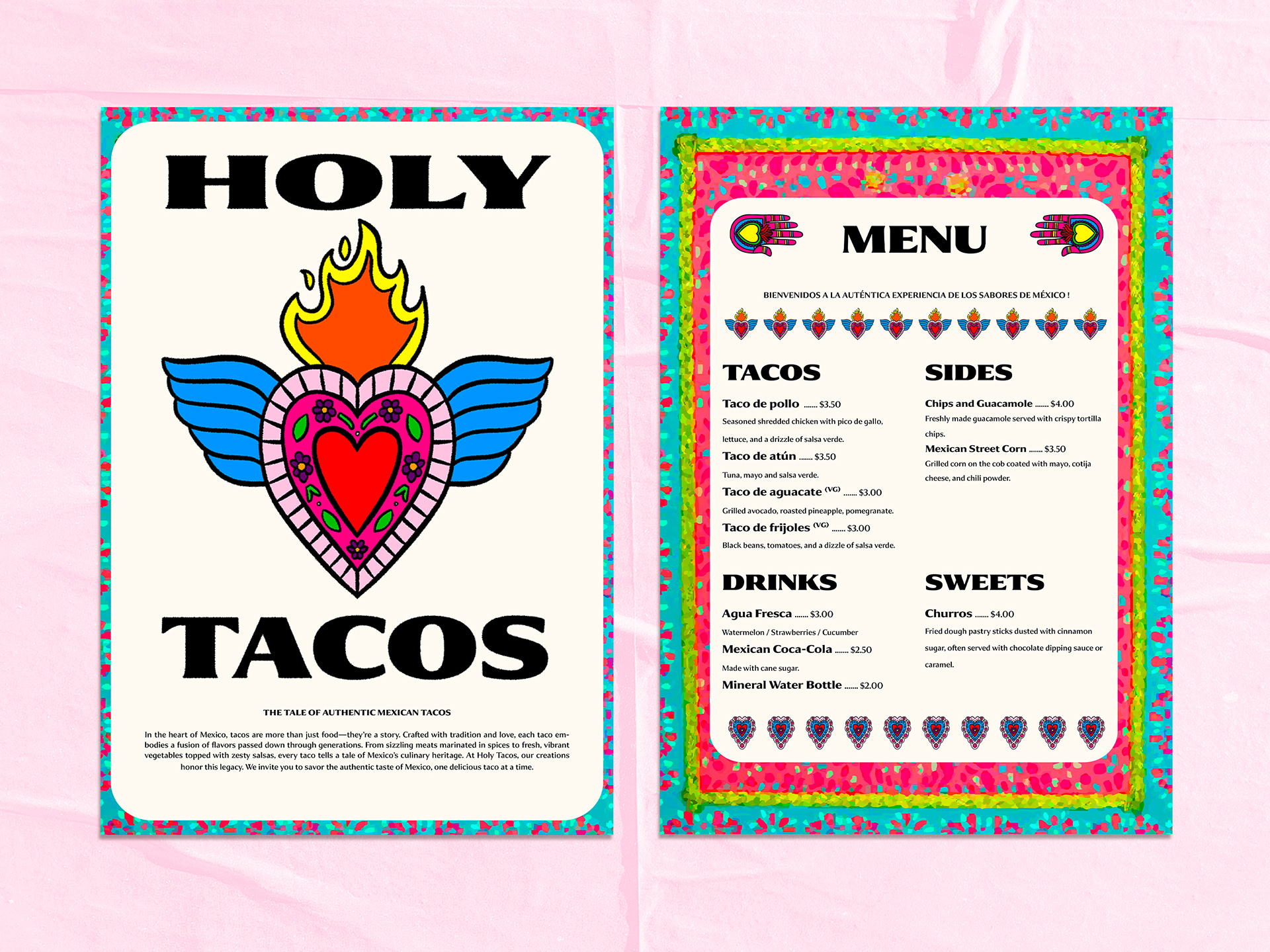
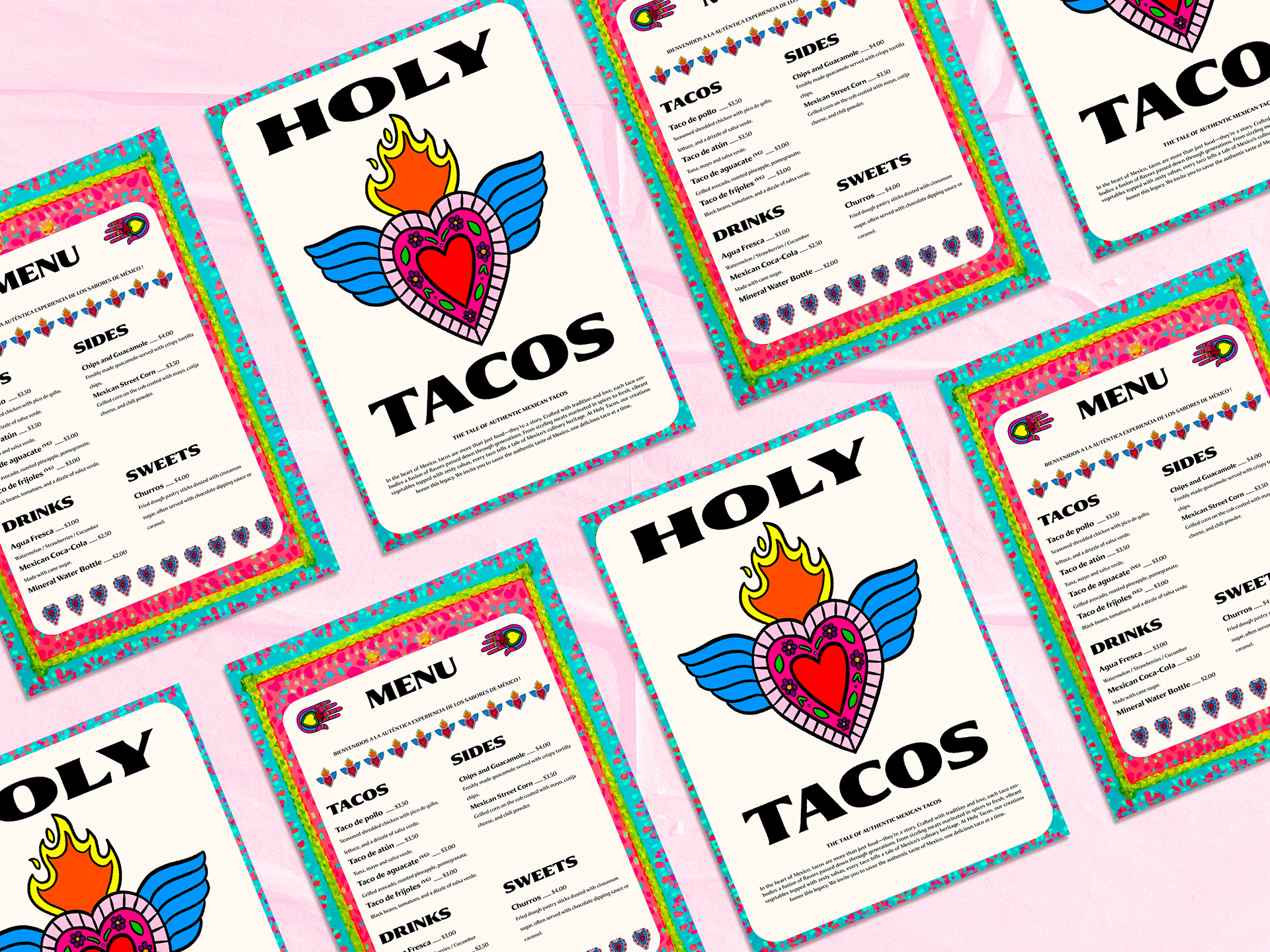
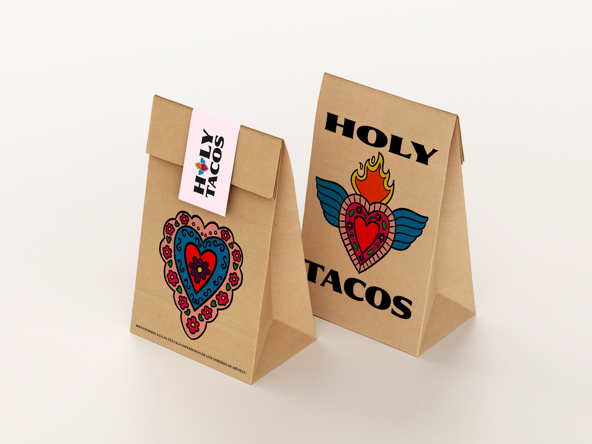
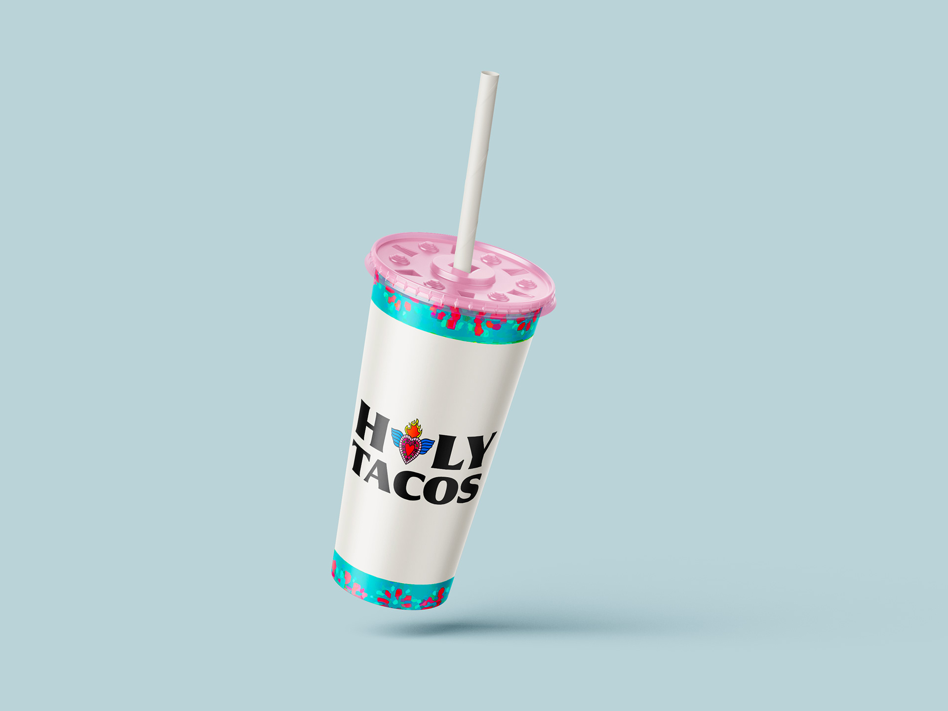
Beyond the logo, the branding extended to packaging, signage, and digital elements, where playful and quirky illustrations brought the taco experience to life. The designs incorporate lively patterns and bold text, ensuring that each touchpoint feels as fun and flavorful as the food itself. Whether on a food truck or in social media, the brand's identity is cohesive, energetic, and engaging.
Throughout the process, the focus was on maintaining the authenticity of Mexican street food while making the brand visually accessible and exciting to modern food lovers. The result is a brand that’s full of life, deliciously bold, and impossible to ignore just like the tacos it represents.